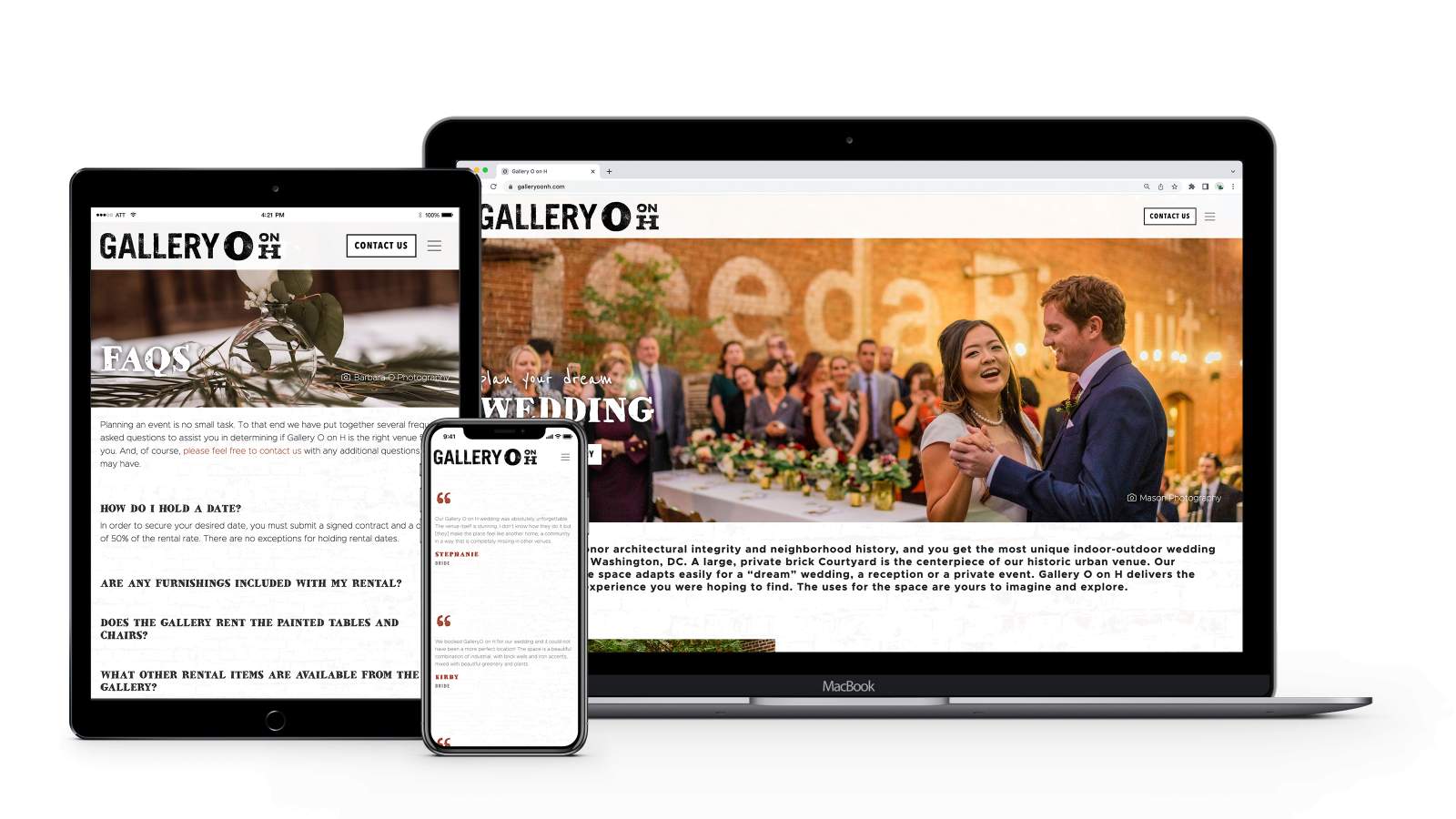
Gallery O on H
Gallery O on H is a unique and beautiful wedding and event space in Washington, DC, and the owners wanted a website that would reflect the distinctive style of the venue itself.
Gallery O’s previous website met the business’ needs for a time, but it was lacking in a few significant ways. For the owners, the primary fault with the previous site was its look and feel. It felt like your typical wedding website—very pretty, dainty, and clean.
But because the owners at Gallery O take great pride in the unique “urban grittiness” of the space, it was important that the site provide that same feel. In addition to a misrepresentative visual style, the site also had a convoluted navigational structure and lacked some of the features, functionality, and flexibility that Gallery O wanted.
With the new website, we took great care in making sure it truly felt like an extension of Gallery O itself. We worked with the owners to define a unique visual style for the site—utilizing mixed fonts, a rustic color palette, and different design elements like a textured background.
The overall site structure and content was reconfigured to create an engaging and intuitive user experience. And the site and its custom content management system (CMS) have the built-in flexibility to grow and evolve as Gallery O does.
As with all of our new websites, Gallery O’s was built to be responsive. And the implementation of the Infinitus CMS—Ingenious’ own custom Content Management System (CMS)—will make for easy management of site content.
