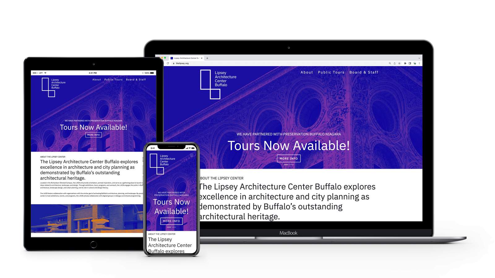
Lipsey Architecture Center Buffalo
The Lipsey Architecture Center Buffalo (LACB) aims to shine a light on the Buffalo’s exceptional architectural heritage, and their outdated website impeded their ability to do so.
LACB’s old website was dull and failed to engage its users in a meaningful way. With the new site, the goal was simple—create an engaging, straightforward, single-page website that’s fine-tuned to LACB’s mission.
The most obvious change that can be seen on the new site is the integration of LACB’s updated brand styling. Bold and vibrant colors and imagery create unique and engaging visual interest that really pack a punch.
In terms of site structure, content was pared down and refined to fit into a single-page layout. The simplified navigation provides quick links for users to jump down the page right to the information they need. The new site also includes a dedicated space for LACB to identify and showcase their valued partners and sponsors as well as the ability for users to sign up for their mailing list.
And all the site content is easily editable through the site’s custom content management system (CMS).
With it’s simple structure and streamlined user experience, LACB’s new site is small but mighty, and will shine a positive light on Buffalo’s architectural heritage.
