TrainSMART Personal Fitness
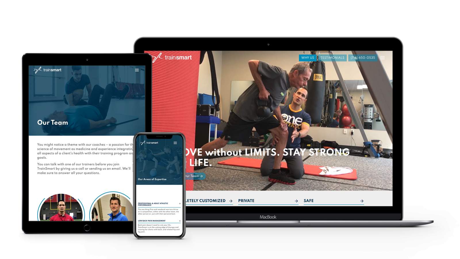
We revitalized TrainSmart’s website with a refreshing new color scheme and a vastly improved user interface.
TrainSmart’s old website was cluttered and disorganized, making it difficult for their clients to find the information they needed. Now, their new website is organized and has a streamlined navigation to help simplify the user interface (UI), improve overall user experience (UX), and give the site a professional look and feel. Users can now easily navigate to the most important content—like TrainSmart’s services listing and online training videos.
The updated website debuts TrainSmart’s vibrant new color scheme—introducing a more energetic and inviting interface. Unique design elements like the animated profiles also contribute to this newfound energy.
Newly organized content can easily be managed and updated in their custom content management system (CMS). The TrainSmart team can quickly update and add content with ease. With the rising popularity of online services in the wake of the COVID-19 pandemic, it was important for TrainSmart to have an intuitive interface on the back end of things to keep content —like training videos and alerts—fresh for their clients.
And, because our sites are built on a streamlined code base, the site is search engine optimized (SEO) right out of the gate.
